Wednesday, March 25, 2015

Final Blog Post

Name: Katie Maher

Candidate Number: 8149

Centre Number: 20299

Centre Name: Bishop Walsh Catholic School


Evaluation - Question 4

Evaluation - Question 3

What have you learned from your audience feedback?


I asked a range of people of ages and gender to watch my film trailer and look at both my film poster and magazine front cover and give their own opinion. I received all positive feedback off people when they had seen my trailer and other products, this is what they said: 


Improvements

Although the feedback I have received from people who have watched my trailer and seen my products is good, in the second class viewing of my trailer, I received constructive criticism in order to make some improvements.
My peers and class teacher watched my trailer and gave feedback of what I could do to improve. I was told that I should make my shots quicker so that there are more conventions of a trailer used and to build more tension. As well as this, I was told to include music in my trailer as I had not yet included this. 
As I received these improvements prior to finalising my trailer, I had enough time to complete them in order to make my trailer more effective.
In addition to this, within my research I found that Blumler and Katz stated in their 'Uses and Gratifications theory' that films are mostly watched by audiences to achieve entertainment, escapism, information, social interaction and to identify. I decided that to improve my trailer I would have to ensure that some of these areas are addressed. I did this by ensuring my trailer was entertaining and creates escapism through characterisation. This was confirmed through my audience feedback.

Saturday, March 21, 2015

Planning - Film Poster

For my film poster, I have decided that I will have a plain and simple design similar to some of the ones that I previously analysed. I have decided on this as I think the more simple ones are most effective as they do not give too much away about the film and intrigue the target audience into finding more out about it.
With this, I will have a main image covering the whole poster with only the title and billing block covering it. This gives the audience enough information about the film to get a feel of what it is about due to the image, and also enough information to find more about it themselves.


Friday, February 13, 2015

Editing the trailer

In order to make the first half of my trailer be portrayed as a dream, I have edited the brightness and saturation to give it a dream-like bright effect. I think this is effective as it helps the audience to determine between which part of the trailer is a dream and which is reality.
In addition to this, when the character is running through the park, I have added a blurred effect to represent the blurriness of the dream before she wakes up. I feel this is effective as it adds more to the trailer making it look more professional to the audience.
I have cut each shot in order for them to be fast moving to build tension as the trailer goes on.
The music I have added onto the trailer builds tension throughout each shot, however, it is not too dramatic for what is going on in the scene.

Trailer shots

I have used a low shot close up of the character's feet walking past the camera. I felt this was effective as it is showing the character travelling through the park yet in different ways. I feel a variety of shot types and angles creates a more professional looking trailer which is what I am working towards.


I have used an extreme long shot of the character walking through the park but from the perspective of behind a tree. I have done this as I feel it gives an effect that suggests to the audience that she is being watched creating a sense of fear and enigma.


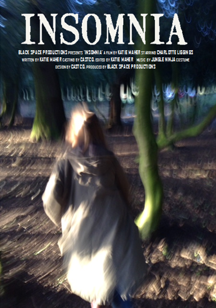
As I am doing a trailer, I have split up my short shots with text. The text informs the audience of when the film is going to be released but also gives clues to what happens in the film. The background I have used is black to create a gloomy and mysterious atmosphere combined with old looking font.

For this shot, I put the camera on the floor and asked the actress to walk over it and walk forward. I feel this is another interesting shot to show the character's journey through the park attempting to keep the audience hooked.


I have chosen to use another shot from behind a tree focusing on the character. This allows the audience to recognise the same theme of being followed and watched throughout this part of the trailer.

To create enigma, I decided to use a shot of the running river in the middle of the trailer. This creates suspense as the audience know the character is being followed and want to know what is about to happen but this shot breaks up the shots of the character.

Again, I used another behind the tree shot to show that the character is constantly being followed. These shots continue to build enigma and suspense for the audience making them want to know what is going to happen and therefore want to come and watch the film.


I have used a low shot showing the character running through the park and jumping over the obsticles. At this point the audience realise that the character is being chased by something unknown creating fear.


Here, this shot is showing the girl being chased. The camera is unstable suggesting that the audience are seeing what the unknown character is chasing the girl, again, creating enigma.


I got my other character of the 'baddie' to hold the camera and walk with it. This enables the audience to see a daunting figure holding a hammer. This immediately will worry the audience and they will be drawn in wanting to know who this person is and what will happen next.

This shot is a close up of the character in bed. It shows the hand of the 'shadow' on her face to stop her from screaming. Only seeing the hand makes the audience wonder who it is creating both fear and enigma.

Again, a shot is used of a shadow hiding the identity of the 'baddie'. This continues the enigma that has taken place throughout the trailer as enigma is one of the key conventions of a trailer. Therefore I feel these shots are effective.


For the final shot, I decided to show the house that the crime has happened in. It looks like a conventional haunted house and will therefore create a sense of fear for the audience.


At the end of the trailer, the name of the film appears with the tag line underneath. This informs the audience of the film title so that they then can research into it and watch it when it is released. The tag line 'Don't fall asleep as the nightmares begin' also gives the audience an insight into the film and what the storyline may entail.

Tuesday, February 10, 2015

Planning: Film Poster

I have decided that my film poster will be quite simple as I feel they are the most effective as people want to find more out about the film as not a lot is given away about it in the poster alone.
With this, the poster will consist of one main image of the main character taking over the whole page with the film title at the top. At the bottom in smaller font, there will be information about the film, for example, the release date, age rating, actors and producers names. 
I feel that the simpler posters are more attractive and therefore I am going to base my poster on this.

Planning: Film Magazine


I have decided to use features from the Empire, Scream and Fangoria covers to create a successful horror based film magazine cover.
I will use the 'Scream' masthead as I think the gory font is effective as it strongly links with the horror genre.
I will use one main image similarly to the Empire's cover to draw attention to the magazine and the main character.
However, I will layer the image with different lures and features to represent the fact that the magazine is packed full of information to intrigue the audience into buying it.
The colour palette will consist of black and green and white for the 'splash' colours as the green will match with the title and also can connote gore, the black connotes gloom and the unknown and the white allows lures to stand out against the colours and ensures the colour palette does not clash as bold colours are being used.
Lures will be placed around the edge of the cover so that the focus is on the character but the audience can also see what is involved within the magazine.

Gap in the market

When researching film magazines based upon the horror genre, I have found that there seems to be a gap in the market as the number of magazines purely focused on horror alone are lacking. This suggests that the magazine industry may have found that horror fans are quite a niche audience and therefore do not think the magazine will be as successful as other genres of film. It also may mean that the horror genre is not taken as serious as others, for example, popular genres such as action may be regarded higher. However, it could also mean that perhaps horror films are more successful in terms of viewing figures and therefore need less promotion.
With this information, I have decided that as there are so many action magazines (suggesting they are most successful) and less horror magazines, I will create a mixture of the two to ensure that my target audience is broad and therefore my magazine will be successful.

Comparing Film Posters


Research: Film Magazine


Research: Film Magazine


Research: Film Magazine